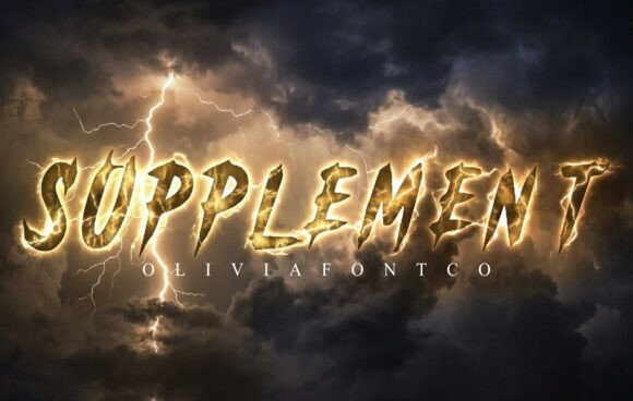
Supplement: A Bold Display Typeface for Digital Impact
It started with a hero section. I was refreshing the homepage for a boutique coaching brand—clean, intentional, deeply human—and needed a headline that didn’t just say “welcome,” but landed. Not polite. Not safe. Something with texture, presence, and a little untamed energy. That’s when I dropped Supplement into the mockup. Instantly, the layout exhaled. The sharp, jagged letterforms didn’t shout—they anchored. Like a hand-carved sign at the edge of a forest trail: raw, memorable, unmistakably alive.
What Makes Supplement Stand Out in a Digital Layout
Supplement is a display typeface built for moments that demand attention—not decoration. Its letterforms are deliberately irregular: fractured edges, asymmetric terminals, and an organic tension that feels less like digital precision and more like expressive mark-making. It’s not chaotic; it’s *erratic* in the best sense—like wind-swept grass or cracked riverbed clay. That visual personality translates powerfully on screen: high contrast, strong negative space, and generous x-height make it surprisingly legible even at moderate sizes. I tested it across devices—from a 13" MacBook to an iPhone 14—and it held its voice without pixelation or awkward spacing collapse.
Where Supplement Shines (and Where It Steps Back)
In practice, Supplement excels where hierarchy and mood matter most:
- Hero headlines and landing page titles—especially over subtle image overlays or textured backgrounds. Its jagged forms create natural visual rhythm against soft photography.
- Section dividers and campaign banners—think “New Offer,” “Join the Waitlist,” or “Seasonal Collection.” Short phrases gain gravitas without extra styling.
- Branded digital assets—like downloadable brand kits, course module headers, or social media cover graphics—where consistency and recognizability reinforce identity.
- Portfolio site accents—used sparingly for project names or category labels, it adds curated edge without overwhelming the work itself.
But here’s what I learned after testing it live: Supplement isn’t meant for long reading. It’s not for navigation menus, form fields, or paragraph text—even at 16px. Its strength is in brevity and intention. I tried it on a mobile footer once—too much visual weight, too little scannability. It belongs in the spotlight, not the supporting cast.
Pairing It Thoughtfully for Real-World UX
The magic happens when you pair Supplement with restraint. I consistently paired it with a neutral, highly legible sans serif—like Inter or Manrope—for all body copy, buttons, and interface elements. That contrast does heavy lifting: Supplement sets tone and memorability; the sans serif delivers clarity and trust. For a more editorial feel—say, on a blog or newsletter—I tested it with a warm, low-contrast serif (like Literata), and the balance worked beautifully: bold yet grounded, expressive yet professional.
Crucially, Supplement includes multiple weights (Light through Black) and stylistic alternates—some with extended terminals, others with tighter spacing. I used the Black weight for hero text, then switched to Medium for subheadings where I needed emphasis without dominance. Ligatures aren’t present, which kept things predictable in CMS environments, and the OpenType features loaded cleanly in Figma and Webflow.
Real-World Readability & Responsive Behavior
On mobile, I found Supplement performs best between 28–42px for headlines—large enough to preserve its character, small enough to avoid awkward line breaks or overflow. Over dark backgrounds, it gains even more intensity (I used #1a1a1a with white text), while on light backgrounds, a slight letter-spacing tweak (+0.5px) helped maintain airiness. It rendered crisply in Safari, Chrome, and Firefox—no hint of font fallbacks or jarring swaps.
One caution: avoid placing it directly over busy imagery without sufficient contrast or a subtle overlay. Its detail gets lost in noise. A 20% black-to-transparent gradient behind the text solved that every time. Also, test it with your CMS preview—some platforms compress webfont files aggressively, which can mute fine details. Supplement’s clean vector outlines handled compression well, but always verify in-browser before launch.
Licensing, Formats, and Practical Next Steps
Before adding Supplement to any client site or public-facing template, I double-checked the license. It includes full webfont files (WOFF2, WOFF), desktop use, and commercial rights—ideal for agencies, freelancers, and product creators building digital brand assets. No hidden restrictions for SaaS dashboards or e-commerce banners, as long as usage aligns with the standard commercial terms. It supports Latin-based languages out of the box, and the glyph set covers common diacritics—enough for most English, Spanish, French, and German deployments.
If you’re evaluating Supplement for your next project, ask yourself: Does this moment need quiet elegance—or electric presence? If it’s the latter, and you’re ready to guide attention with intention, Supplement doesn’t just fit the role—it redefines it. It’s not background music. It’s the opening chord.