Kamel: A Bold Display Typeface for Digital Brand Impact
It started with a client’s landing page—clean layout, strong photography, but something felt… muted. The headline needed to land like a first impression at a gallery opening: confident, intentional, unforgettable. That’s when I dropped Kamel into the hero section. Instantly, the whole page exhaled. Not louder—but *clearer*. More human. More memorable.
What Kamel Brings to the Screen
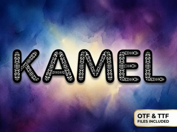
Kamel is a premium display typeface built for visual storytelling—not utility. Its artistic strokes, subtle irregularities, and expressive rhythm give it a hand-crafted warmth you rarely find in web fonts. It’s not trying to vanish into the background; it’s designed to hold space, invite attention, and communicate personality before a single word is read. Think of it as your digital signature—elegant but grounded, distinctive without being distracting.
I tested Kamel across real projects: a boutique online store’s seasonal campaign banner, a coaching website’s “About” headline, a course sales page’s value proposition, and a portfolio site’s project titles. In every case, it elevated perceived quality—not by looking expensive, but by feeling *considered*. That matters deeply in digital spaces where users scan in under three seconds. Kamel doesn’t just say “this is important”—it says “this is worth your attention.”
Where Kamel Shines (and Where It Steps Back)
Kamel thrives where brevity meets intention:
- Hero section headlines — especially over textured backgrounds or soft image overlays (its contrast holds up beautifully)
- Section headers — “How It Works,” “What You’ll Learn,” “Our Story” — giving structure emotional weight
- CTA buttons — when styled thoughtfully (e.g., uppercase, generous letter-spacing, ample padding)
- Logo text or wordmarks — for brands embracing artisanal, creative, or lifestyle positioning
- Blog post titles — on editorial-style layouts where tone and voice are central
But—and this is crucial—Kamel isn’t meant for body copy, navigation menus, form labels, or dense dashboard interfaces. Its decorative character reduces scannability at small sizes and low contrast. On mobile, I found it performs best above 32px for headings and never below 24px—even then, only with high-contrast backgrounds and generous line-height. For accessibility and usability, always pair it with a highly legible sans serif (like Inter, Poppins, or Montserrat) for all supporting text.
Responsive Behavior & Real Layout Testing
I stress-tested Kamel across breakpoints. On desktop, its expressive curves and spacing breathe naturally. At tablet width, I adjusted tracking slightly (+20–30 units) to prevent crowding. On mobile, I switched to a tighter-weight variant (if available) or scaled down only the font-size—not the letter-spacing—so rhythm stayed intact. Crucially, Kamel loaded quickly via modern WOFF2 files, and its hinting held up well across Chrome, Safari, and Firefox.
One surprise: Kamel worked exceptionally well over dark-mode backgrounds. Its stroke contrast remained legible without needing heavy drop shadows—just subtle text-shadow (0 1px 2px rgba(0,0,0,0.2)) for polish. Over light images? I used a semi-transparent overlay behind the text block—not to hide the font, but to ensure hierarchy stayed anchored.
Smart Pairing for Digital Harmony
Pairing Kamel isn’t about compromise—it’s about choreography. I consistently paired it with a neutral, highly functional sans serif: Inter for its exceptional readability at small sizes and robust variable-weight support; or Poppins for a slightly warmer, friendlier counterpoint. Never tried pairing it with another decorative font—too much personality in one space creates visual noise, not harmony.
For more editorial or luxury-leaning sites, I experimented with a restrained serif (like Lora or Playfair Display) for pull quotes or subheaders—but only when the brand voice demanded quiet sophistication alongside Kamel’s bolder presence. The key was always contrast: if Kamel is the voice, the secondary font is the ear that listens.
Practical Checks Before You Deploy
Before using Kamel on any live site or client project, I verified:
- Webfont availability — confirmed WOFF2 + fallbacks were included, not just desktop OTF/TTF
- Weight range — looked for at least Regular and Bold (essential for hierarchy); bonus points for Light or ExtraBold for nuanced emphasis
- Ligatures & alternates — checked whether stylistic sets improved flow in common phrases (e.g., “the”, “and”, “of”)
- Language support — verified Latin Extended-A coverage for international clients or multilingual content
- Licensing clarity — ensured commercial web use was explicitly permitted (not just “personal use”) and covered SaaS, e-commerce, and client work
Most importantly—I tested how it rendered in actual browser conditions, not just design tools. Figma previews lie. Real devices don’t.
Kamel won’t fix weak messaging or poor UX. But when your brand has something meaningful to say—and wants to say it with presence—it gives your words texture, warmth, and quiet authority. It’s not just a font. It’s a deliberate choice to stand out, not shout.